Did you know? eCommerce software by Pinnacle Cart has built-in, mobile-ready themes that can help you get optimized within the same day of launching your store. We highly recommend you check out their system for ease-of-use, security, and overall awesomeness. We had a client recently launch their student headphones business with this same type of platform.
You’ve successfully set up your ecommerce website. Congratulations! You’re ready to start selling so you can begin raking in those profits. But wait: is your ecommerce website mobile-optimized?
If you answered “no” or “what’s mobile optimized?” you’re in for a treat!
Tracking the mobile trends
We wouldn’t be all over mobile-optimized websites if there weren’t solid facts informing us of the present revolution in how people used the Internet for leisure and commerce.
2014 marked the crucial junction that showed equal numbers of PC and mobile device users surfing the Web. Prior to 2014, mobile users were lagging behind to the mighty laptop/PC users who have ruled the usage trend for the past 8 years.
In the first quarter of 2015, 51% of all adult users surfed the Internet using their smartphones and tablet computers. This means that websites that were ready to accommodate the smaller screens of mobile devices provided superior experience than websites that are optimized for PCs and laptops only.
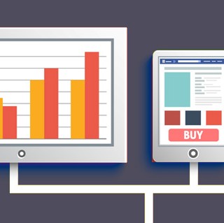
What about buying stuff online? From July to December 2014, ComScore reported a 4% increase in sales from mobile devices, bringing the figure up to 57% (that means only 43% of all consumers surveyed used their PCs or laptops to buy stuff from online stores.)
Serious marketers need to be readier to face tougher competition, too. Google Think Insights reports that 33% of online buyers start their search from branded websites while a sizeable 26% began their product discovery from mobile apps. While 48% still used search engines as their primary search tool, you have to take into account the remaining 52% that didn’t.
Advantages of being mobile-ready
– As of April 21, 2015 Google will be ranking mobile-ready websites higher than non-mobile friendly ones. This is a fantastic way to weed out non-responsive sites that haven’t been adjusted to fit the changing Web landscape. So if you have superior products or content, expect your website to still take a hit if it’s not ready for mobile traffic.
– Mobile-ready websites adjust automatically to different devices. This technique is called “responsive design” and it took off from the idea that one design is enough for everyone as long as the website is able to serve the right resolution and visual elements depending on what device is being used to view it. Good old WordPress is hailed as one of the “first responders” to this call for responsive website themes.
– Casual browsers become buyers. People browse the Web on their mobile phones and tablets to relax and entertain themselves. People love relaxing – so why not turn that traffic from relaxed individuals into retail gold? If you can capture the attention of visitors who are casually browsing, you can increase sales through your mobile-ready online store. And you get to keep dedicated buyers who surf using their laptops or PCs, too!
– Mobile means faster loading times. No one likes waiting around for a page to load. By keeping your web pages tightly focused on the essentials, your ecommerce site is going to function more efficiently and it will be a joy to visit and revisit in the future!
No Comments